Sports Design
The art of sports graphic design
 Hamza Zakouni1 min read
Emotion, photography and type under a deadline
Sports graphics have a job most design does not: they have to carry emotion that already exists. Nobody needs to be persuaded to care about the goal. The graphic has to match a feeling that is already at full volume, and it usually has about ninety seconds to do it.
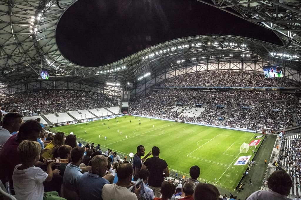
That makes photography the foundation rather than the decoration. The crop decides the emotion — a wide frame of a full stadium says something completely different from a tight one of a player's face, and no amount of typography will rescue the wrong choice. Most of my time on a matchday graphic goes on selecting and cropping, not on layout.
Type does the opposite job: it has to be read instantly and then get out of the way. Two names, two numbers, at a size that survives a phone screen held at arm's length in a loud room. Condensed weights earn their place here because they let a long name stay large.
Atmosphere is where the club's identity lives. The same scoreline template in club colours, with the club's grain and its own crop conventions, is what makes a graphic recognisable before anyone reads it. Clubs that get this right are recognisable with the crest cropped out — which is a good test of any identity, and a demanding one at social-media size.
The constraint that shapes everything is the clock. When the whistle goes there is no time to make a decision, so every decision has to already exist as a template. The template is the design work; the individual graphic is an instance of it. That is not a compromise, it is the discipline the format demands.
Get an email when a new article goes up
Occasional writing on identity, typography and sports design. No more than that, and easy to stop.
Follow
The work itself, as it happens.